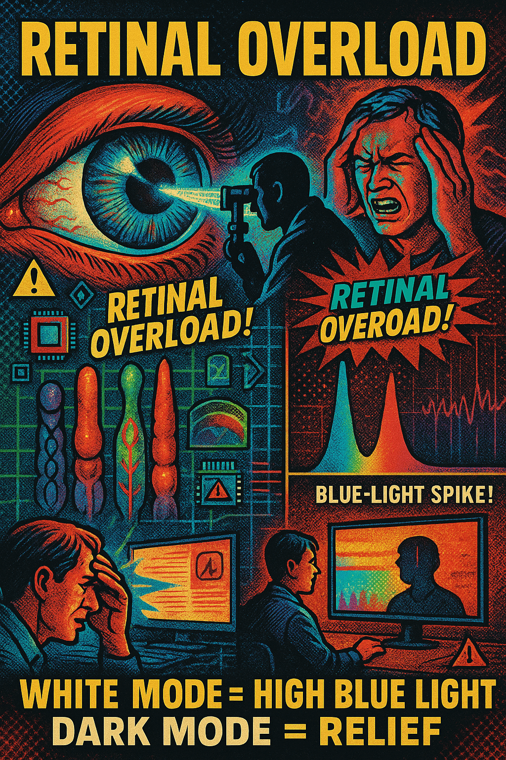
A straight, objective, physiology-based explanation of eye fatigue, retinal overload, and blue-LED hazards when comparing:
- Tiny, low-contrast dark text on a massive bright-white background
vs. - Small bright text on a dark background (“dark mode”).
1. Retina & Photoreceptors: Why bright backgrounds cause overload
The retina contains rods and cones that adapt to overall luminance. When the background is large bright white, especially on LED screens (which peak in blue wavelengths):
- The entire retina is flooded with high-intensity light.
- Cones, especially S-cones (blue-sensitive), become overstimulated.
- Pupil constricts fully to limit the overload.
- The tiny dark text forces the user to keep focusing precisely while the background is blasting the retina.
Effects:
- Retinal bleaching (temporary saturation of photopigments).
- Foveal fatigue because the tiny text requires pinpoint fixation.
- Reduced blink rate, causing eye dryness.
- Photostress recovery time increases — meaning it takes longer for the retina to “recover” after each page or screen.
This is why staring at bright white screens feels like “burning” or “painful pressure” behind the eyes.
2. Blue-LED Danger Factor
LCD/LED screens have a strong spectral spike around 450 nm (blue).
Bright-white backgrounds = maximum emitted blue-light intensity.
Physiological consequences:
- Blue light scatters 2× more in ocular media → more glare.
- Blue wavelengths cause oxidative stress in retinal pigment epithelium (RPE).
- Prolonged exposure is associated with:
- Macular strain
- Headaches
- Circadian disruption
- Increased photochemical stress
Bright white backgrounds maximize this hazard.
Dark backgrounds reduce blue-light emission drastically.
3. Why tiny dark text on bright white is worst-case scenario
This combination is uniquely harmful because it couples:
- High retinal load from the bright white
- Low contrast + tiny letterforms
- Constant accommodation + micro-saccades
- Maximal blue light intensity
- Refocusing strain every second
- Pupil constriction → reduced depth of field → more refocusing strain
- Dry eye due to reduced blinking
- Glare halo around the tiny text due to intraocular scattering
Net effect:
Maximum retinal fatigue. Maximum headache probability. Maximum photochemical stress.
Users often report:
- Throbbing behind eyes
- Nausea-like symptoms
- Difficulty focusing afterward
- Lingering afterimages (“white haze”)
These are classic signs of retinal overload.
4. Why bright text on dark background is better
“Dark mode” distributes luminance in the opposite direction:
- The retina stays in a mid-to-low activation state.
- Pupil opens slightly → more stable accommodation.
- Less glare and scatter.
- Less blue-light output.
- Less photobleaching of cones.
Advantages:
- Significantly less retinal stress
- Lower blue-light dose
- Lower risk of headaches
- Better for long-form reading at night
- Less fatigue from micro-contrast changes
However, pure white text on pure black background can create slight halation (“glow effect”) due to pupil dilation — but it is still dramatically less harmful than bright-white backgrounds.
5. Which is safer?
Most dangerous / most fatiguing:
Tiny dark text on bright white LED screen.
Worst combination of:
- retinal overload
- blue-light intensity
- tiny fixation target
- glare + scatter
Safest / least fatiguing:
Moderate-sized bright text on a dim, dark, or charcoal-gray background.
Optimal configuration:
- Text: #E5E5E5 (soft warm gray, not pure white)
- Background: #121212 to #1E1E1E (dark charcoal)
- Screen brightness: 25–35% for indoor use
- Blue-light filter: warm tone (reduces spectral spike)
6. Why paper is different (but modern “bright white” paper is also bad)
Traditional cream-colored, matte paper reflects broad-spectrum, non-spiky light, not LED luminance.
But reading tiny black text on ultra-bright glossy paper under strong light still causes similar foveal fatigue.
Summary Table
| Feature | Tiny dark text on bright white | Bright text on dark background |
|---|---|---|
| Retinal load | Extremely high | Low |
| Blue-light intensity | Maximum | Low |
| Glare | High | Minimal |
| Eye strain | Severe | Mild |
| Photobleaching | High | Low |
| Headache likelihood | High | Low |
| Long-term comfort | Very poor | High |
| Night reading | Harmful | Ideal |
Final Verdict (Objective, Physiology-Based)
Tiny dark text on a bright white LED background is the single worst configuration for eye comfort, retinal health, and blue-light safety.
Bright/gray text on a dark/charcoal background is inherently safer, less fatiguing, and less hazardous.
If you want, I can also provide:
- A scientifically optimized reading color palette
- A “safe mode” CSS you can inject into browsers
- A Windows/macOS screen-tone configuration for eye safety
- Or a full explanation of photostress recovery curves and macular pigment response